Thursday, 29 November 2012
Video Comparison
These videos have been put into comparison because there are a few shots throughout Rihanna's video where she is stood in front of a car and the headlights are shining from behind her.
Tuesday, 27 November 2012
Tuesday, 20 November 2012
Editing Technique Ideas
The editing in this video is something i would like to do in my own. When the split screen is on i think that it is a good technique and how it sweeps to the side. The way the two different sides are from the same shots look really effective, how in one side there is a close up of the lead singer then next to it its a long shot.
500 days of summer is a personal favourite of mine and this is where i thought of the idea of the Expectations and Reality. i think this would fit really well into the video of whistle for the choir and the idea i have of the boy following about the girl in the reality section then the boy and the girl together in the expectations side.
500 days of summer is a personal favourite of mine and this is where i thought of the idea of the Expectations and Reality. i think this would fit really well into the video of whistle for the choir and the idea i have of the boy following about the girl in the reality section then the boy and the girl together in the expectations side.
Audience Profile
I have chosen a girls Facebook Profile for additional information for audience research. This is a typical profile for the type of genre our music video would appeal to. Alex has a cover photo of Jack Steadmen Bombay Bicycle Club's front man. BBC are a indie band and are very popular in the current music industry. You instantly know what type of music she likes with what her cover photo reveals.
Advert Analysis
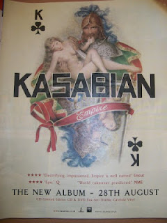
The first magazine advert that i have decided to look at is Kasabian. There is a lot of typical features on this advert such as the name of the band and the illustration in the background as well as the name of the album (Empire). On the bottom of the advert in very small font it gives you Kasabian's official website were you will be able to purchase the album.
The image used of the advert is of a playing card with the king of spades on, the King card might represent that this album is the highest standard of music which is represented through the playing card. Also the image is of two soldiers carrying women who is a lot smaller and has no clothes on, this could be used to show the dominance the man has against a women, the illustration also looks like it has purposely been drawn this way to create a god like feel, and because the title of the album is called Empire the man at the top could be the ruler of the Empire. The big bold writing of 'KASABIAN' is the font that the band always uses, it is like the trade mark for the band. The red ribbon with the word 'Empire' on is in a different font from the rest of the album, this adds to the effect of the advert being regal and royal.
This is Kasabian's second album release in 2006, since then the other albums that followed have all had the coherent theme of the solider uniforms and the royal setting. Because this is the second album the band will already have a certain amount of follows who expect more from the second album, so the songs have to be a lot better from the first to keep the fans happy. The art work of the album and the way it is advertised is certainly very important. If this advert had lots of different colours and it just didnt follow on from the design of the first straight away that may effect the appeal to the fans, but it also needs to be interesting and stand out from other bands of the same genre to be able to get more fans. The target audience for this advert would be people of 16+ i don't think that the age would go much younger than 16 because there is a lot of taboo language in their songs, also this art work is more mature and sophisticated than that of artist who aims their music to a younger audience.
Monday, 19 November 2012
Shot Count Task
Shot Count - 126
I chose the Maccabees for my shot count task because it fits the genre that i will use for my music video. There is a lot of repetition of shots in the video, however, in this video it works well. The First shot we see is high angle of a women laid on the floor, which we see later on in the video a close up from the top of her head drawing around herself with a piece of chalk for it to later be revealed that she has moved from the spot cuddling the chalk drawing of herself which illustrates the songs lyrics. When the music changes so does the shot. 46 seconds into the video we see the whole band in a long shot but without their instruments, it then cuts to a man sat on a chair in a medium shot, then cuts straight to a close up to his hand and we see him drawing on his hand with lipstick. There is a lot of things going on in this video with all of the different stories in it, e.i when the women is laid down drawing around herself with the chalk, then the man with the lipstick, the women gluing the handle back onto the cup etc. i chose to look at The Maccabees video for First love because it has all of the conventions of the genre that i want in my music video which is indie/ alternative rock. The way the band move to the song is quite awkward but fits in with the song and this is the type of behavior you would tend to see in this type of genre.
Digipack Analysis
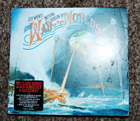
This digipack i have decided to look at is the musical version of War Of The Worlds written by Jeff Wayne. I have chosen this digipack because the music on the cd's would fit under the indie genre.The front of the Digipack has a big giant robot on the front attacking a ship. This relates to the whole design of the Digipack because it is all about the War Of the Worlds.
This is the inside of the 6 panel. The first pane is just a basic white background with the title of the Digipak. The next two panes are really interesting because there is an image on the background that relates to war of the worlds but then the disc design is incorporated into it. I really like this idea and think this would be great to take this idea and incorporate into my own design of my Digipak. When i first found this Digipak i didnt realise at first that this is what the design was for, so taking that on board i will make sure if i do take this idea i will make the image a lot clearer.
Wednesday, 14 November 2012
Audience Profile
I have chosen a girls Facebook Profile for additional information for audience research. This is a typical profile for the type of genre our music video would appeal to. Alex has a cover photo of Jack Steadmen Bombay Bicycle Club's front man. BBC are a indie band and are very popular in the current music industry. You instantly know what type of music she likes with what her cover photo reveals.
Rough Cut
This is our rough cut that will not be getting used anymore, as we have changed the song. We took into consideration the beats of the song to ensure that the cuts were in time with each beat, we used a variety of different shots such as close ups, long shots, high angles and pans, carefully mixing them together so that no shot was the same as the one used before it. To make our music video more interesting, we used shots from outside where the members where walking about and we made it look like a casual day out for them, and shots from where the band were actually performing, so it was an assortment. Some of the downsides of our filming and editing is the graininess of some recordings, this is a result of the bad lighting inside the practice studio. A problem we had with our editing was that some of the cuts were not quick enough to fit in with each beat, as we did not have enough successful footage, if we did, then we would have had more cuts in the video to match the pace of the song.
Subscribe to:
Comments (Atom)


